Healthcare · Lead UX Designer
Customer Service Interface (CSI)
Geisinger Health System
Executive Summary
Geisinger is one of America's leading rural healthcare providers. CSI is their core customer service platform, used by agents to handle calls and document every member, provider, and broker touchpoint. Built in 2008, it was functionally sound but visually and structurally outdated.

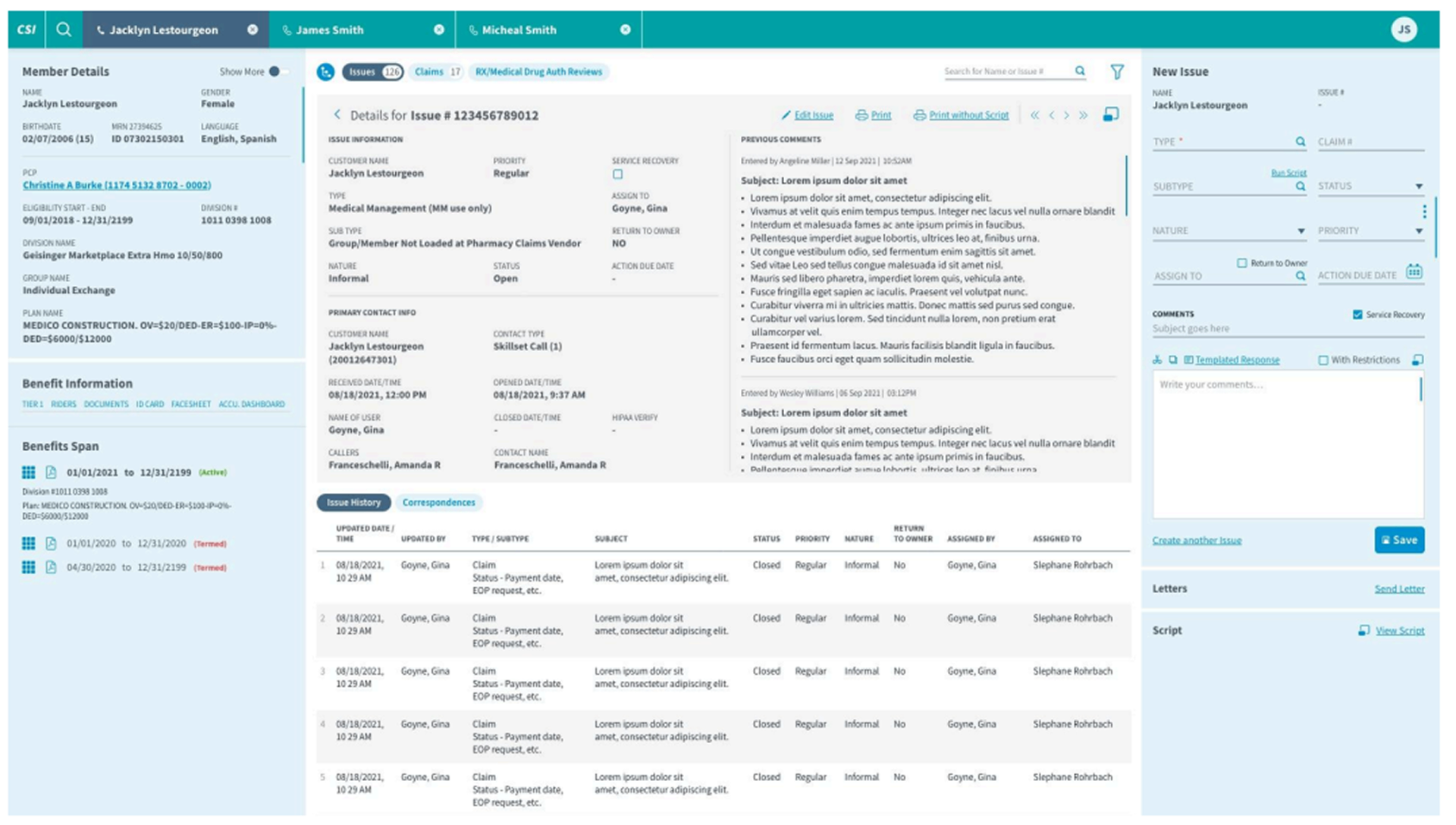
Customer Service Interface — redesigned three-panel detail page
01 — The Challenge
What we walked into.
Legacy by design
Built in 2008, CSI still performed well functionally, but a decade of typography, layout, and interaction patterns no longer matched modern user expectations or other tools agents used daily.
Information overload
Most sections required constant scrolling, with too many controls exposed at all times — overwhelming users with choices instead of supporting their actual workflow.
Fragmented information
Related data lived across multiple screens and applications, forcing agents to cross-reference constantly during live customer calls.
02 — My Role
Lead UX across a 10-week engagement.
As Lead UX Designer, I owned the end-to-end redesign across a 10-week engagement — from discovery interviews and heuristic evaluation through information architecture, visual design system, and a clickable prototype covering 40+ screens and 36+ reusable components.
03 — Research & Discovery
How we learned what mattered.
10-Week engagement
Discover
Reviewed the current application, established task flows and boundary conditions, identified key improvement areas and KPIs.
Ideate
Conducted user interviews, analyzed findings, ran review sessions, established design direction.
Prototype
Added screen-level detail, built a clickable prototype, designed supporting components, icons, and design guidelines.
Handoff
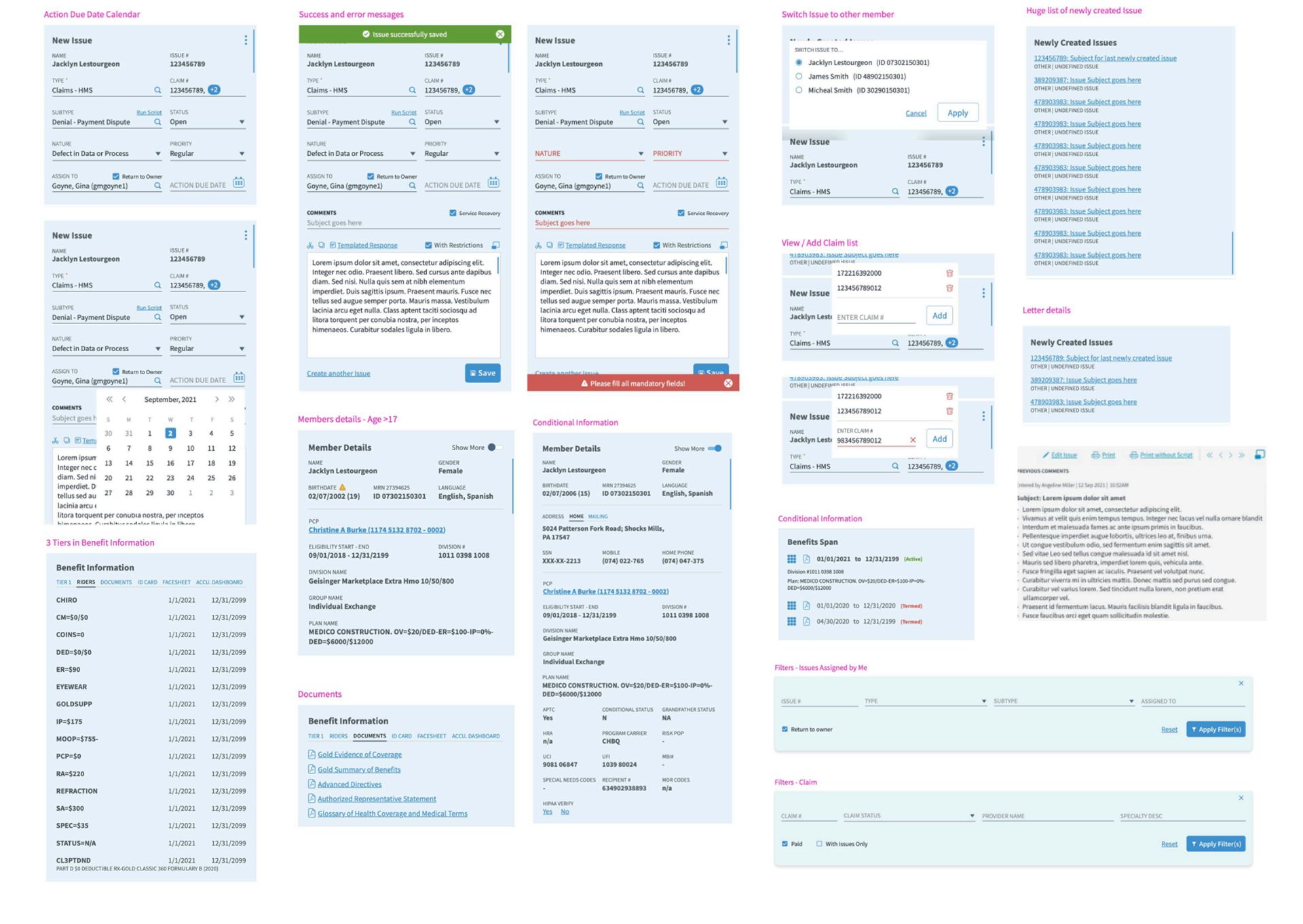
Delivered design system, component library, and clickable prototype across 40+ screens to engineering.
User interviews
Grace J. Thorpe
Customer Care Supervisor
Kent A. Cooper
Customer Care Coordinator
Gina M. Goyne
Customer Care Coordinator
David O'Reilly
Customer Care Agent
Analysis approach
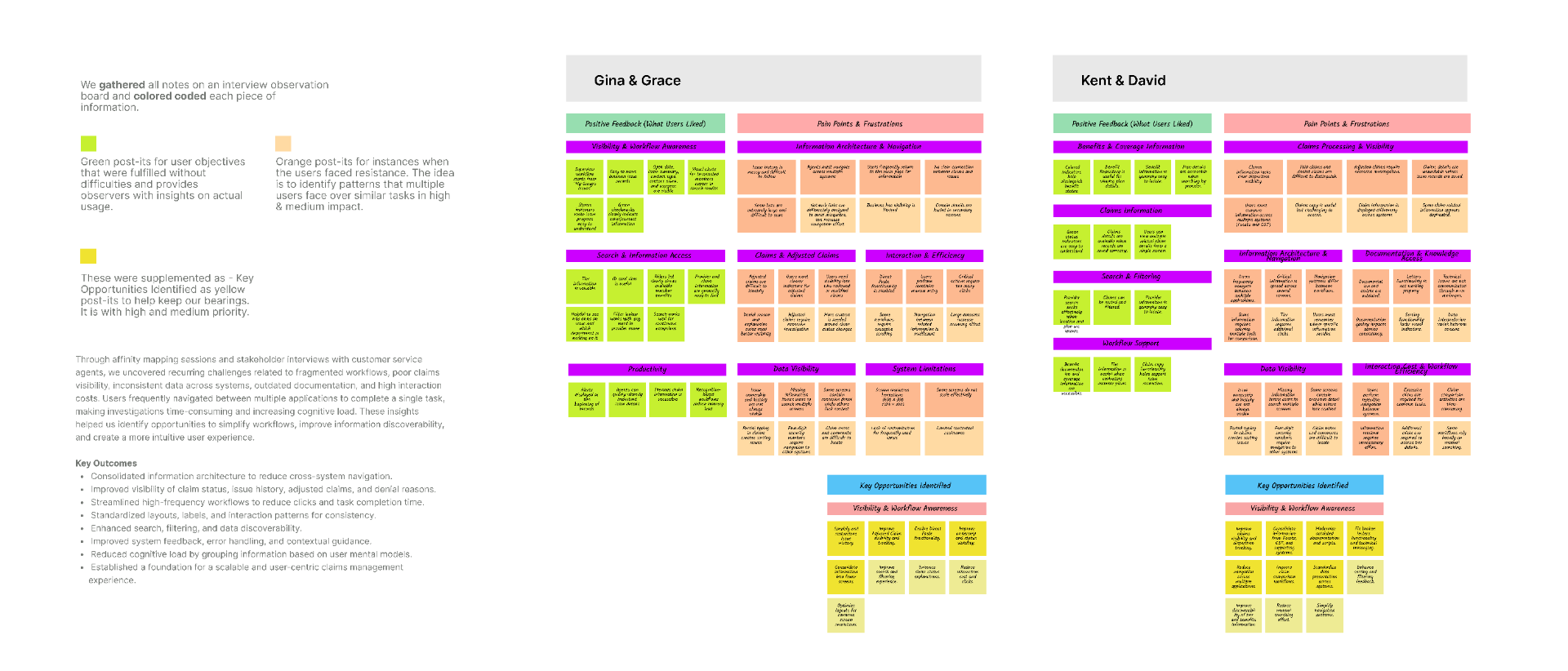
Affinity mapping
Interview observations were clustered on a shared board and color-coded to distinguish moments of friction from moments where users moved through their workflow with ease.
Research synthesis
Key Outcomes from Affinity Mapping
Through affinity mapping sessions and stakeholder interviews with customer service agents, we uncovered recurring challenges related to fragmented workflows, poor claims visibility, inconsistent data, outdated documentation, and high interaction costs. These insights helped identify opportunities to simplify workflows, improve discoverability, and create a more intuitive user experience.
Consolidated Information Architecture
Reduce cross-system navigation by centralizing critical information into a unified experience.
Improved Claim Visibility
Clear visibility of claim status, issue history, denial reasons, and adjusted claims.
Streamlined Workflows
Reduce clicks and task completion time for high-frequency tasks.
Standardized Patterns
Consistent layouts, labels, components, and interaction behaviors.
Enhanced Search
Improved search, filtering, and faster access to critical information.
Better System Feedback
Improved guidance, error handling, and contextual assistance.
Reduced Cognitive Load
Organized information around user mental models, making navigation and decision-making easier.
Scalable User-Centric Foundation
A scalable framework for future claims management enhancements and operational growth.
Summary of observations
What the interviews revealed
Information spread across screens
Required constant cross-referencing between applications.
No customization
All components shown to all users at all times, causing on-screen interference.
Excessive scrolling
Most sections held too much information for the available space.
Decision fatigue
Redundant icons and too many exposed controls overwhelmed users.
Built-in tools helped
Users were well-acclimatized and intelligent shortcuts supported their workflow.
Heuristic evaluation
Four evaluation lenses
Effectiveness
Hierarchy
Ease of Learning
Error Prevention
Key findings
- Visual load from decade-old typography
- Lack of information hierarchy
- Improper feedback and status indicators
- Content placement and consistency issues
- Lack of proximity in grouped information
- Redundant icons increasing decision fatigue
Stakeholder survey
Six stakeholders, three questions
In the final phase of discovery, six stakeholders were surveyed on three questions to validate our design direction against their vision for the future.
What are the top three things you'd like to see improved in claims handling?
Side-by-side claim comparison, ability to expand/collapse service lines, and a clearer header summarizing claim status.
What's the one change that would define this redesign as a success?
Claims simplification — reducing the steps and screens needed to resolve a single claims-related issue.
What recent experience inspired your idea of good UX, and why?
Stakeholders cited modern consumer apps with fast search, clean information hierarchy, and minimal clicks to complete a task.
Stakeholder feedback consistently pointed toward claims simplification, side-by-side comparison views, and a more modern visual language — directly validating our heuristic findings.
04 — My Approach & Key Decisions
Make it modern.
What we focused on
Redesign tenets
Key decisions
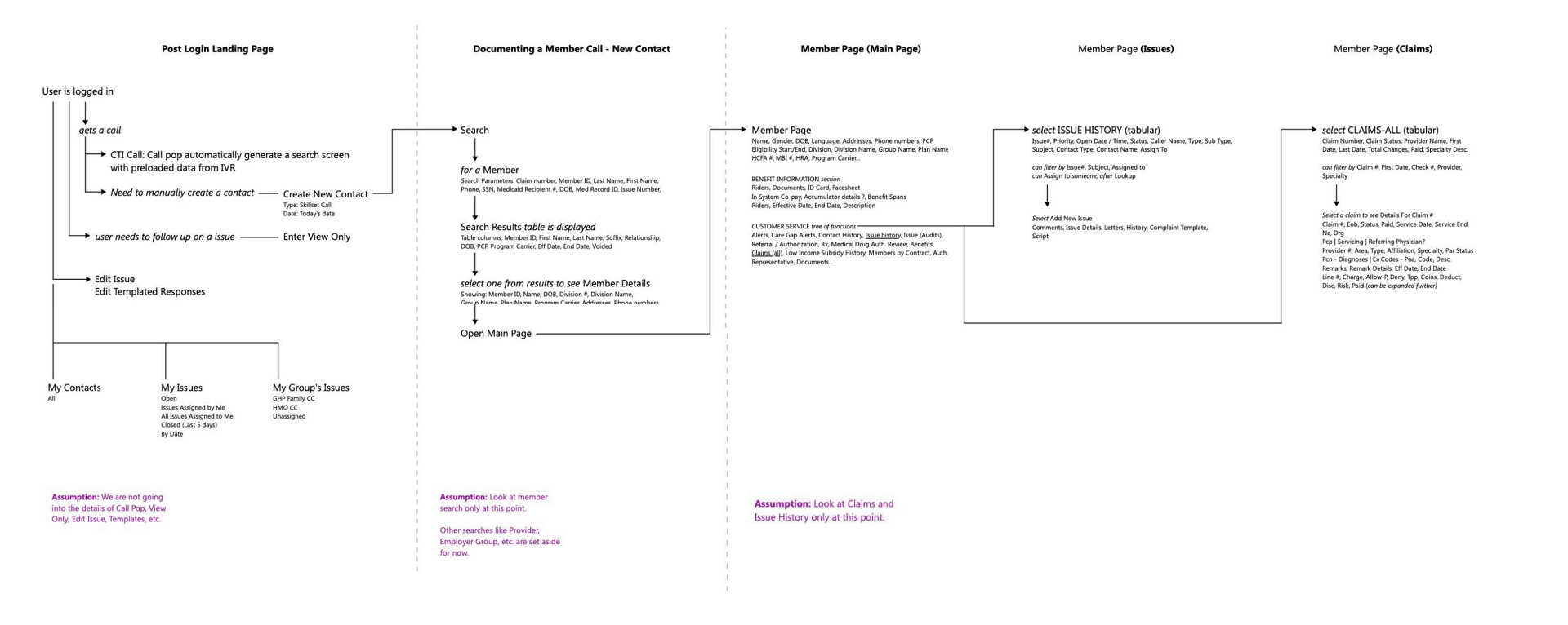
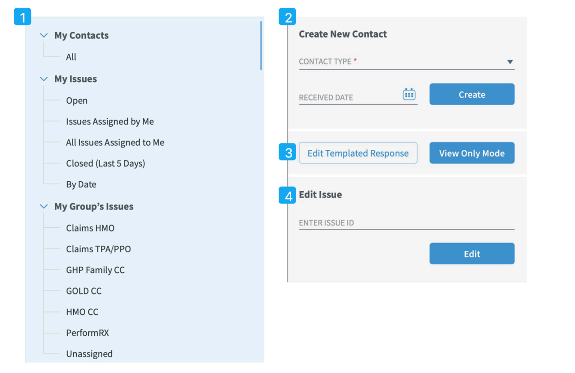
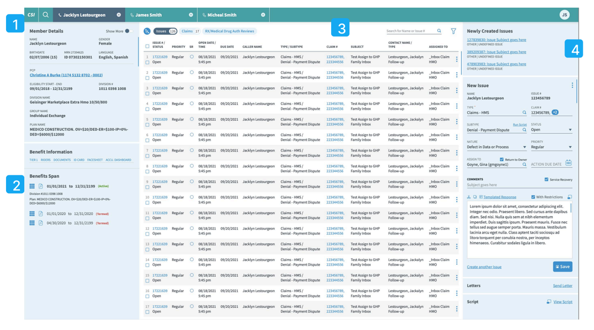
Three-panel workflow layout
We chose a three-column layout tracking the natural workflow (lookup member → find claim/issue → document discussion) over the previous six-box irregular layout, because it mirrored how agents actually moved through a call and reduced disorientation.
Independent column scrolling
We chose to let each panel scroll independently over a single-page scroll, because agents needed to reference member details while working in the claims panel without losing their place.
Surface-level modernization
We chose to focus on typography, color, grid, and iconography over a structural rebuild, because CSI's underlying workflows already worked — the goal was reducing visual load without retraining 10+ years of muscle memory.
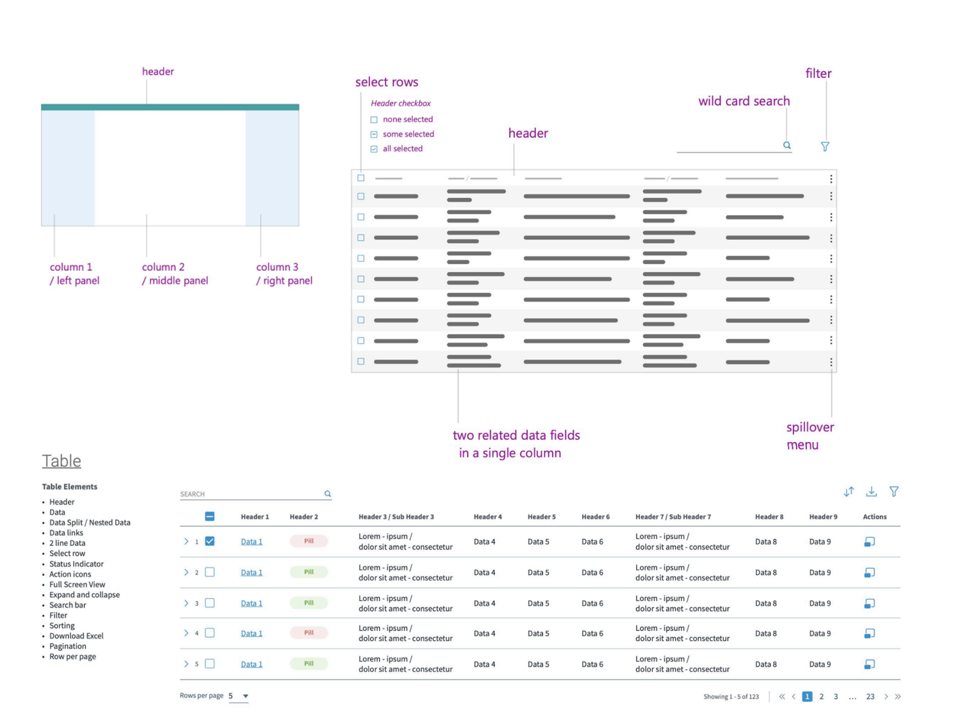
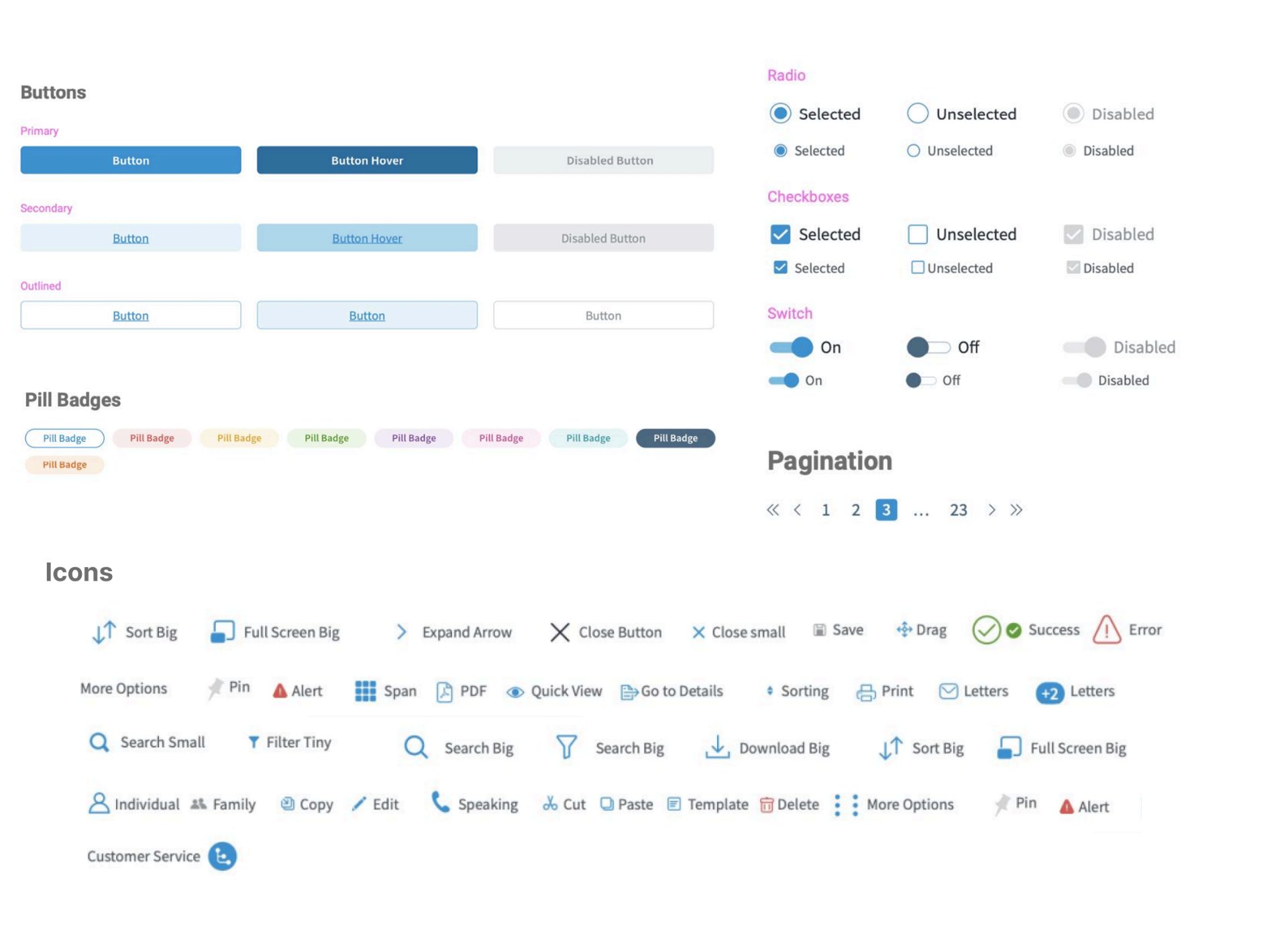
Design system
Typography & color foundations
Typography
Montserrat
Display & headings
Source Sans Pro
Body text
Color palette
Grey tints
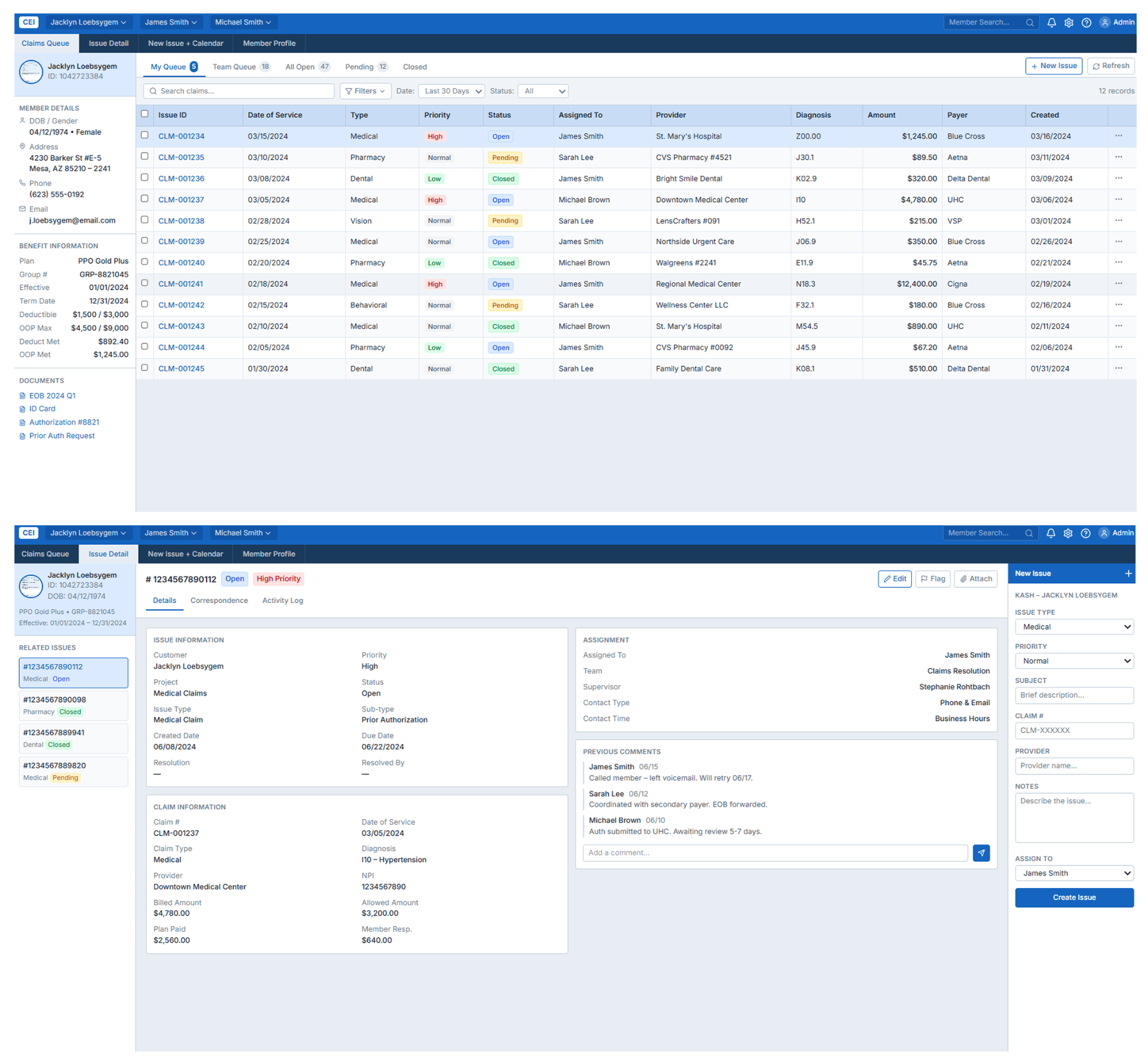
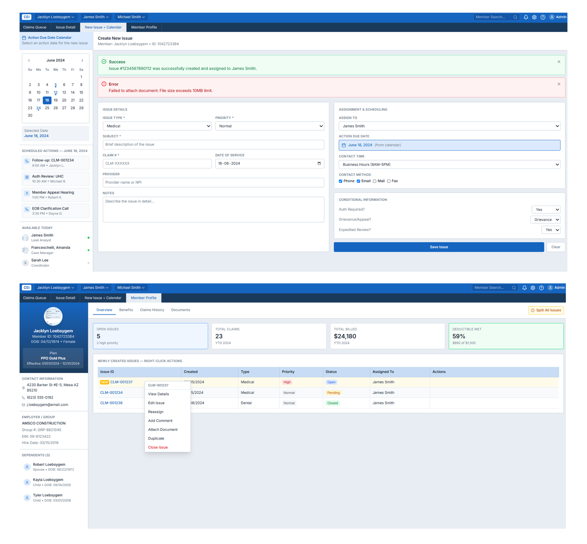
05 — Final UI Screens
The screens that shipped.
06 — Outcome & Impact
What it moved.
Delivered a modernized Customer Service Interface that preserved the workflows agents had used for over a decade while addressing the visual and structural issues identified through heuristic review and stakeholder interviews. The new three-panel layout, refreshed design system, and component library gave Geisinger's customer care teams — agents, coordinators, and supervisors — a faster, less cluttered path through every member interaction.
07 — Reflection
What I'd do differently.
Given how long CSI had been in use, I'd build in a short transition period with side-by-side old/new views for power users — the redesign reduced clutter significantly, but agents who'd memorized exact button positions for 10+ years would have benefited from a guided walkthrough before the full switch.
Tools Used