SAP for Me
Redesigning SAP's personalized central customer portal for clarity, visibility, and scale.
SAP for Me is SAP's personalized central customer portal — a single entry point for organizations to manage products, services, licenses, and support. This case study documents the redesign process; screens are illustrative placeholders for portfolio purposes.
Role — UX Designer · Focus — Customer Success and Sales & Marketing · Collaboration — SAP Germany team & SMEs.
Enterprise SaaS · UX Designer
SAP for Me
SAP (via Capgemini)
Executive Summary
SAP for Me is SAP's personalized central customer portal — one entry point to manage products, licenses, and support. The redesign focused on Customer Success and Sales & Marketing journeys, improving clarity and visibility at scale.
01 — About the product
A single, transparent entry point for every SAP engagement.
SAP for Me is SAP's personalized, central customer portal designed to give organizations a single, transparent entry point to manage all their SAP products, services, licenses, and support interactions.
It acts as a digital companion that aggregates alerts, metrics, product insights, support cases, financial information, system status, and learning resources in one place — helping customers and partners streamline their SAP engagements and make faster, more informed decisions.
Partner Dashboards
Customer Dashboards
SAP for Me's dashboard structure — organized by Partner and Customer roles, giving each user group a single, transparent entry point into the tools relevant to them.
02 — Role & Responsibilities
Redesigning within SAP's design system.
My primary responsibility was redesigning SAP for Me by following SAP's current Fiori Design System and established guidelines — while identifying customer pain points and proposing solutions across multiple features and use cases.
Focus areas
03 — Approach
A human-centered, non-linear design process.
Empathy and continuous feedback across Empathize → Define → Ideate → Prototype → Test — the same methodology used by the SAP team for the Fiori design system, ensuring solutions are user-friendly, technically feasible, and validated through rapid prototyping.
Non-linear — teams loop back between stages as new evidence emerges.
Foundational Understanding
Understanding the product, the wider SAP ecosystem, and the business requirements driving the redesign.
Understand the People
Stakeholder interviews, user behaviour reports, journey mapping — identifying pain points and motivations.
Synthesize Findings
Identify patterns and themes, prioritize user needs, establish clear design goals for the workstream.
Brainstorming & Solutions
Brainstorming sessions, sketching, and selecting feasible high-impact concepts within SAP guidelines.
Collaborating with Stakeholders
Design refinements, feasibility checks against the Fiori Design System, and SME collaboration.
Interaction & Validation
Reduce motor load, ensure consistency and user control; move from low- to high-fidelity prototypes and iterate.
04 — Key Contributions
Where I made an impact.
German team collaboration
Worked with the SAP for ME platform team in Germany to enhance usability and accessibility across the portal.
Stakeholder alignment
Engaged with stakeholders to understand business and user needs, ensuring alignment with the updated Fiori Design System.
Structured design process
Followed a structured, iterative design process to deliver optimal solutions across multiple customer use cases.
Multi-use-case coverage
Translated user research into design solutions grounded in the current Fiori guidelines, spanning several product areas.
Continuous iteration
Iterated designs through continuous feedback loops with stakeholders, SMEs, and the wider SAP design community.
05 — Users
Who SAP for Me serves.
Cloud Administrators
Authorized to manage SAP cloud-related tasks and services across the customer's landscape.
Business Stakeholders / IT Managers
Use dashboards to monitor the product portfolio, licensing, and system health at a glance.
Partners
Access dashboards tailored for managing customer relationships and delivery projects.
S-User / Technical Administrators
Manage user authorizations, create new users, and handle support cases end-to-end.
06 — Research & Discovery
Aligning across teams and analyzing the existing product.
Discovery workshop
Stakeholder alignment across seven cross-functional roles — mapping existing workflows, business goals, constraints, and success metrics before any pixels were pushed.
Existing product analysis
Analyzed current screens, journeys, and interaction flows across: registering a new project, checking/updating project status, grouping projects under a customer, project reporting, project details, and project stakeholders.
"To view details for a specific project ID, users had to copy the ID and paste it into the Customer Cloud Project Waves search box." — a clear usability gap.
Empathy workshop — pain points
Five recurring themes emerged from the empathy workshop, color-coded by category for prioritization.
Insufficient Project Details
Missing Project ID, Wave Number, Solution Area, and Wave Scope — users struggled to differentiate projects across customer waves.
Cumbersome Update Process
Difficult to locate relevant project information; non-intuitive workflow causing delays and missed updates.
Lack of Update Guidance
No clear indication of which products required updates — creating ambiguity and reducing partner engagement.
Overwhelming Bundle Display
Business-suite bundles created clutter and difficult navigation; multi-item updates became cumbersome.
Limited KPI Visibility
No visibility into Missing Date, Past Due, or Upcoming statuses — users couldn't prioritize by urgency.
Behavioral study
Mixed-method research — stakeholder discussions, product walkthroughs, user interviews, and usability testing — was used to map journeys and tag KPI cards and list views for behavioral signals.
Applies to: the Upcoming Planned Go-Lives KPI card
Gives users high-level visibility into immediate alerts, key updates, and upcoming go-live dates at a glance.
Applies to: the customer project table / search-based project list
Insufficient project details on the card make it hard for users to find and act on relevant projects.
Applies to: both the KPI card and the customer project table
The KPI card is used as a filter for upcoming go-lives by date; the table is used to search and locate specific projects — together the two most-touched surfaces in the flow.
Applies to: the "Projects Not Created" panel
Represents draft/unregistered projects; requires no action from this user group, so engagement here is naturally low.
07 — Pain points distribution
Where the friction is concentrated.
08 — Define
Framing the problems worth solving.
Incomplete Project Information
Insufficient details on the project card — Project ID, wave, solution area, and wave scope were not surfaced.
Inefficient Partner Workflow
Cumbersome process for partners to find relevant project information and provide timely updates.
Unclear Update Ownership
Lack of clarity on which products or solution areas required updates — discouraging partner engagement.
Complex & Cluttered Bundle View
Overwhelming display when bundles were involved, especially with business-suite products.
Key design enhancement priorities
Layout Experimentation
Explore layouts that surface key information without overwhelming users.
Multi-Account Visibility
Give users a clear view across accounts, waves, and solution areas.
Flexible Configurations
Allow users to configure views to match their working style.
Future Scalability
A design system-ready foundation that can absorb new product areas.
Role-Based Personalization
Surface the right actions and data per role — partners, admins, stakeholders.
09 — Ideate
Design recommendations.
Enhanced project card layout
- Priority KPIs with color-coded indicators (Missing Date, Past Due, Upcoming).
- Condensed project summary — Project ID, Customer, Wave Number, Solution Area, Wave Scope — as pill-style tags.
- Expandable bundles with progressive disclosure.
- Inline 'Request Update' CTA with a guided checklist.
Project detail page
- Deeper insights into timelines, dependencies, and bundle breakdowns via tabs/accordions.
- Designed to minimize effort and timeline without changing existing user behavior.
- Progressive disclosure keeps the primary card lightweight.
Two solution approaches explored
Optimized existing layout
Quick win, low effort, minimal disruption to existing users.
New layout
Higher effort — significantly improved user experience and scalability.
10 — Prototype · Approach 1
Quick wins within the existing system.
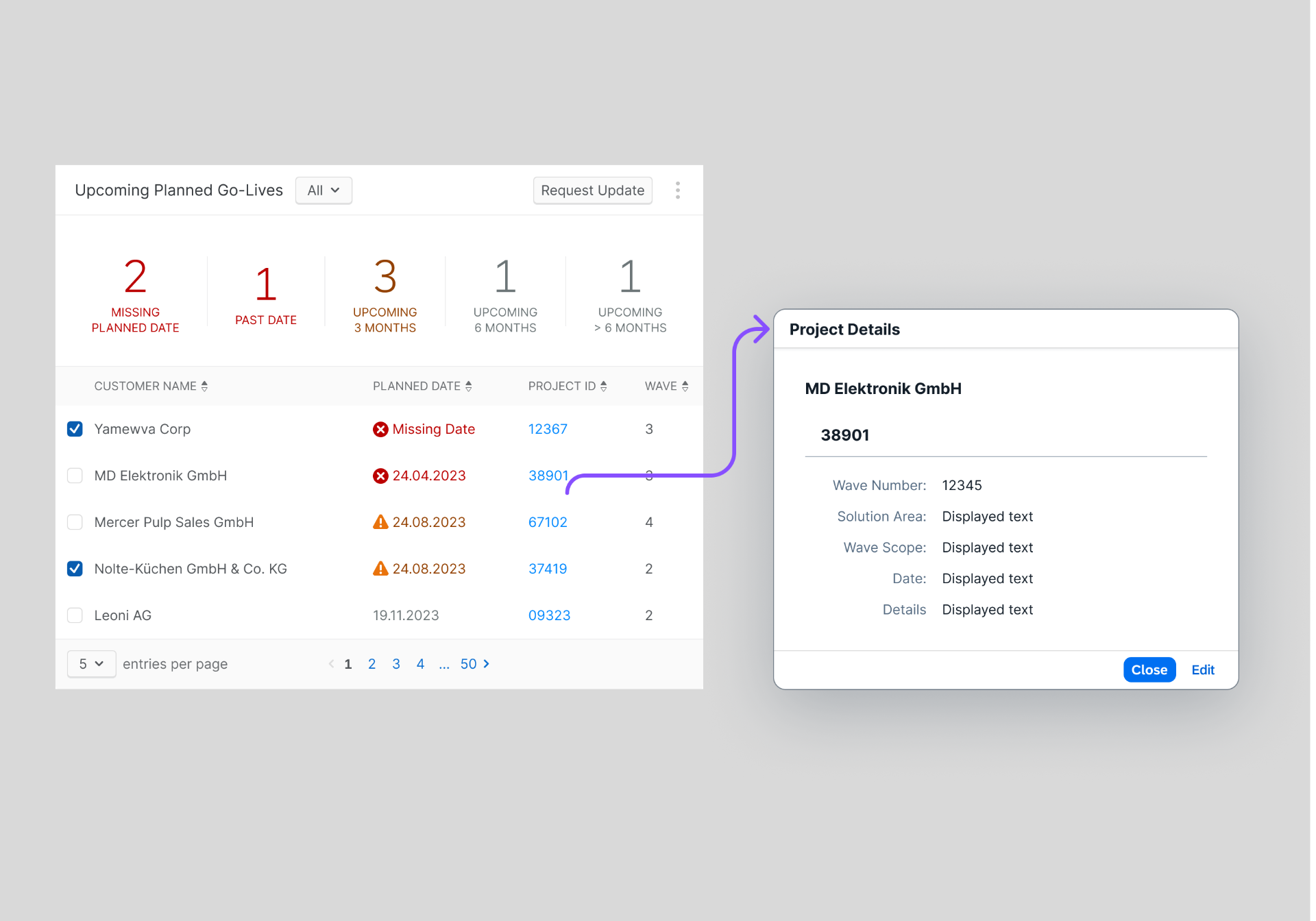
- Project ID made clickable, surfacing key details via a popover — no navigation away from the screen.
- Lightweight, immediate solution for viewing key information.
- Introduced a 'View' action for clearer navigation.
- Modal pop-ups and row-expand options surface detail while keeping users on the same screen.
- Strictly followed the existing Design System for consistency and minimal learning curve.
A fast-to-implement solution that enhances usability while maintaining familiarity and requiring no behavioral change from users.
11 — Prototype · Approach 2
Enhanced experience for the long term.
- All panels consolidated into a single unified table under the 'Customer Cloud Project' header.
- View-selector dropdown in the toolbar switches between table views (e.g., 'Upcoming Planned Go-Live').
- Group icon in the toolbar lets users organize and rearrange data on the fly.
- Constraint: Fiori v1.145 didn't support the previous filter component, so quick-filter options were redesigned within the new system's constraints.
A more intuitive, efficient, future-ready experience with a single-screen interaction model — including a 'View All' option for deeper exploration when needed.
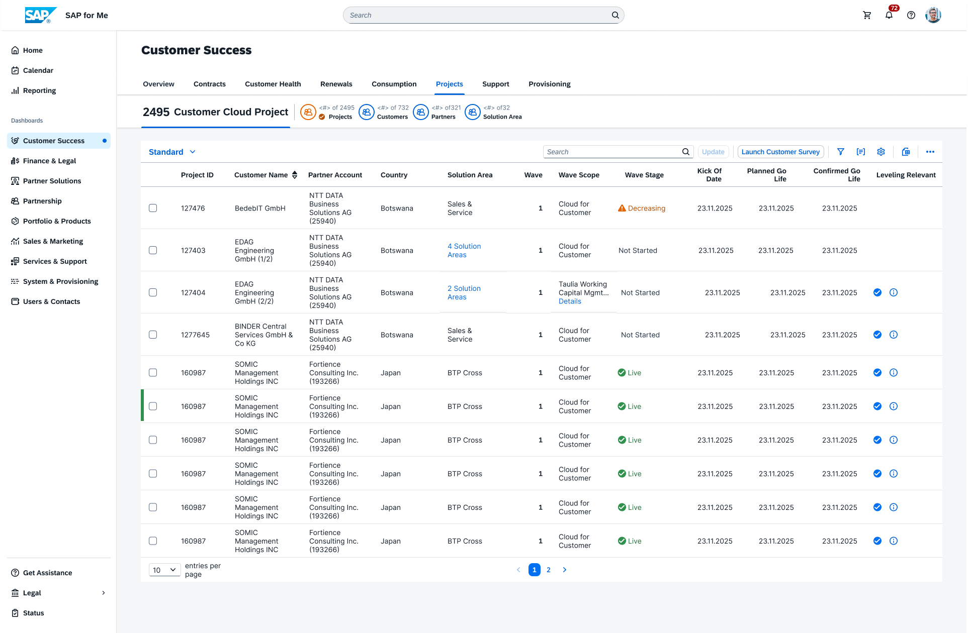
- All three panels consolidated into a single table.
- View-selector dropdown in the toolbar switches between table views.
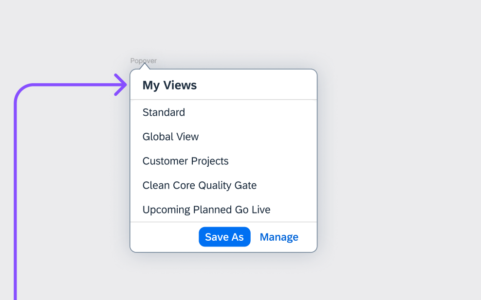
- Group icon lets users organize and rearrange data.
- Fiori v1.145 didn't support the previous filter component — quick-filter options had to be redesigned within this constraint.
| Design problem | Constraint | Thought process | Outcome |
|---|---|---|---|
| Second same-page table needed filter support to match the first table. | Fiori v1.145 no longer supported the previous filter component on a second table. | Explored alternative interaction patterns — view selector, grouping, and unified table — while preserving workflows. | Unified single-table pattern minimized learning curve and kept the platform on the current DS. |
11.5 — Final screens
Delivered views across the customer portal.
Five views shipped as part of the redesign — each surfacing a distinct slice of project data while sharing the same unified table pattern.
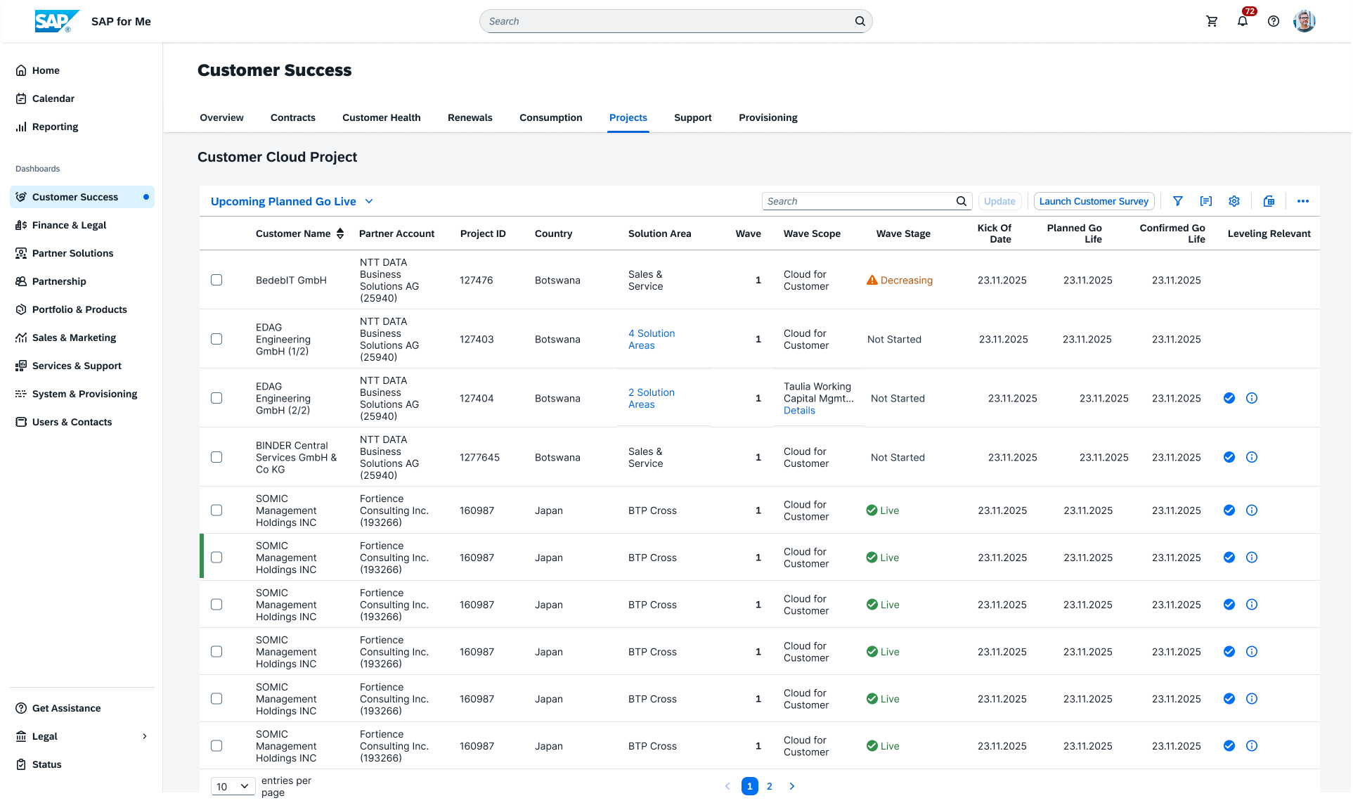
- Default table view for day-to-day project tracking.
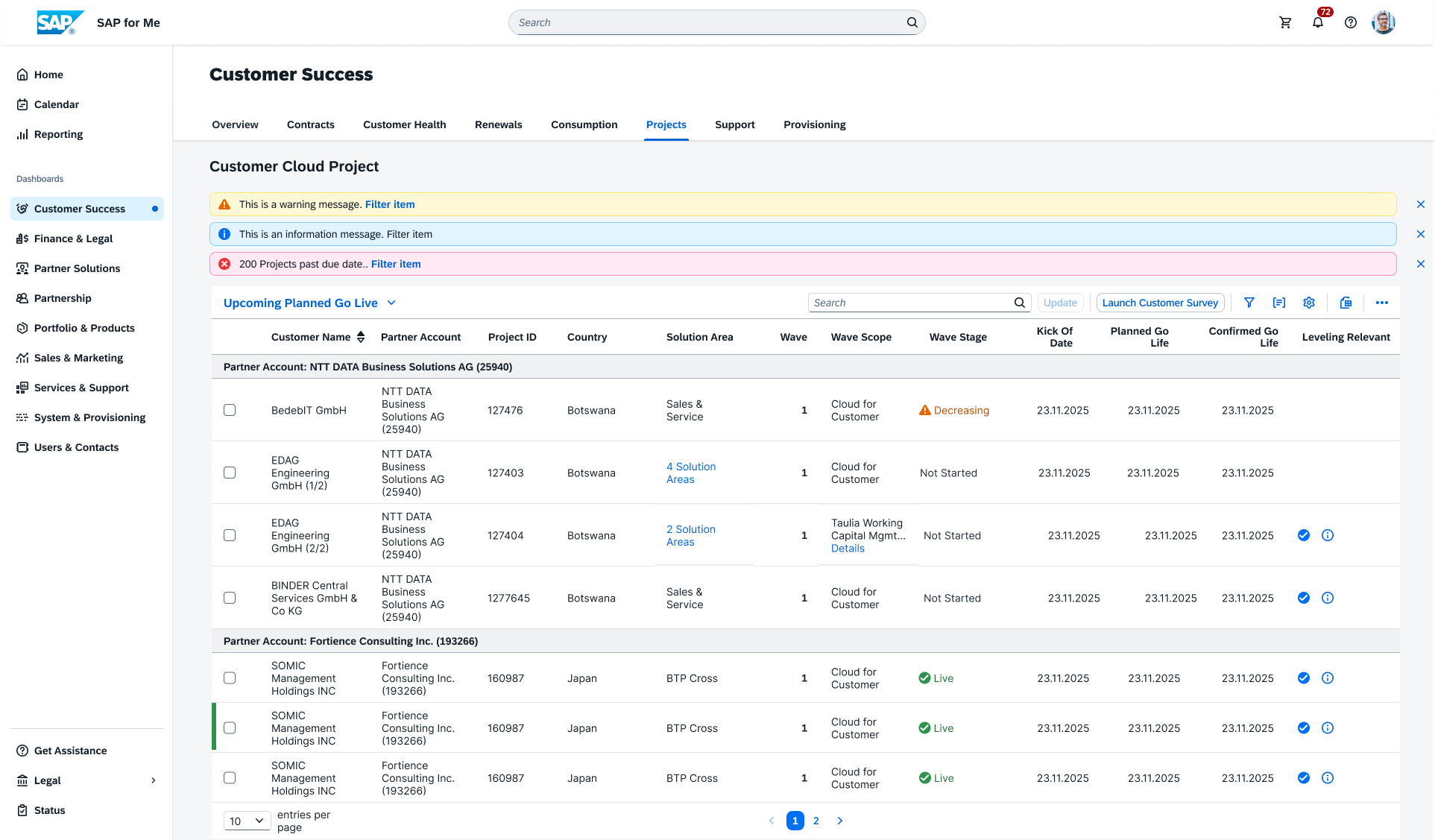
- Cross-account visibility for partners managing multiple customers.
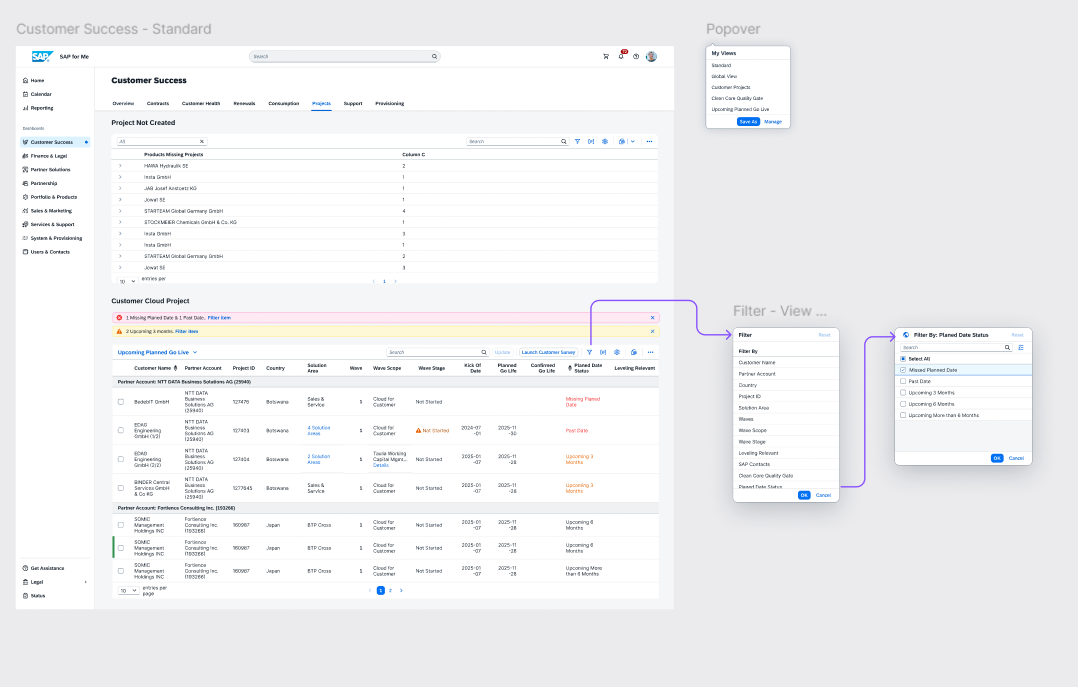
- Projects grouped and filtered by individual customer.
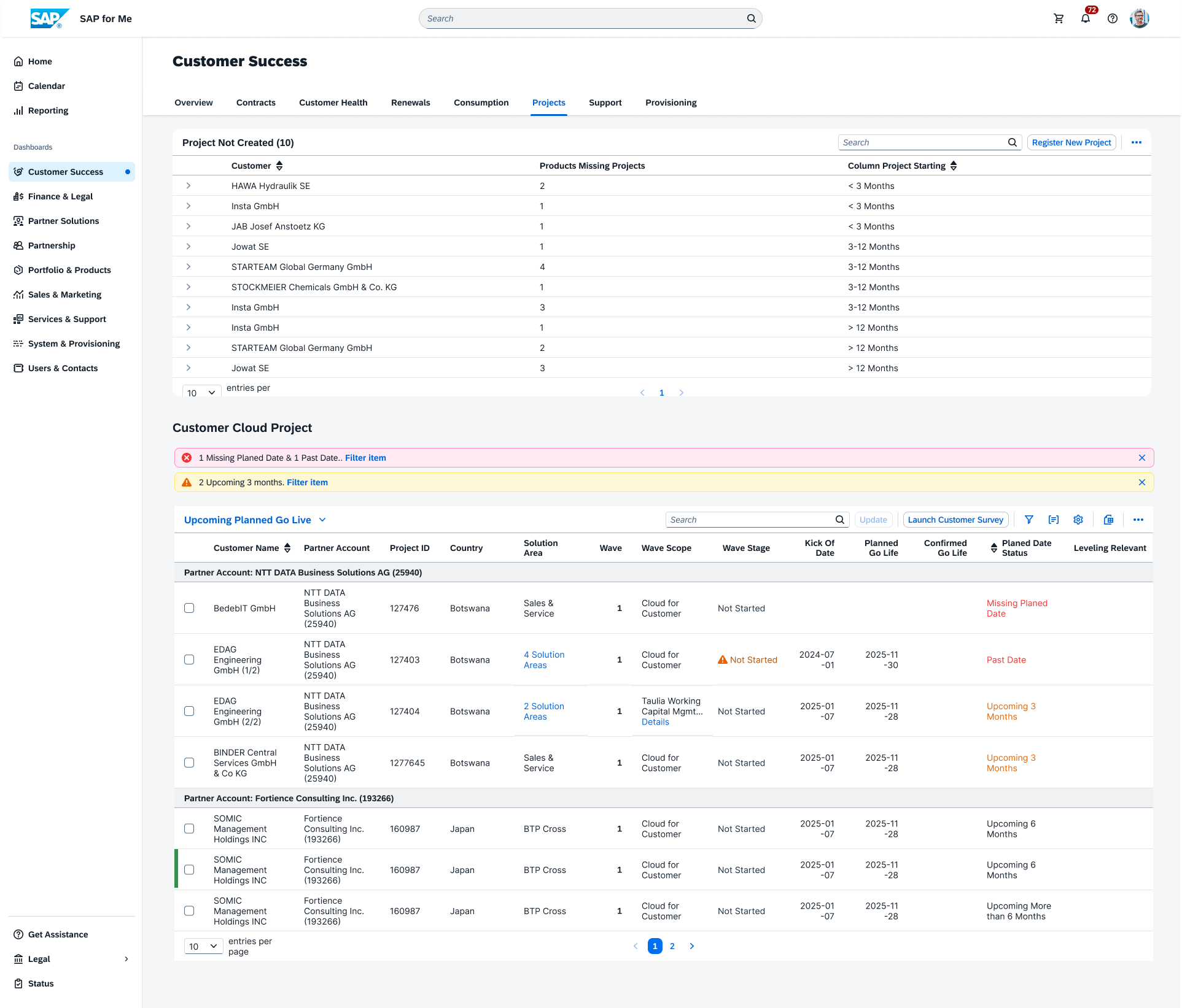
- Compliance / quality checkpoint surfaced inline with project data.
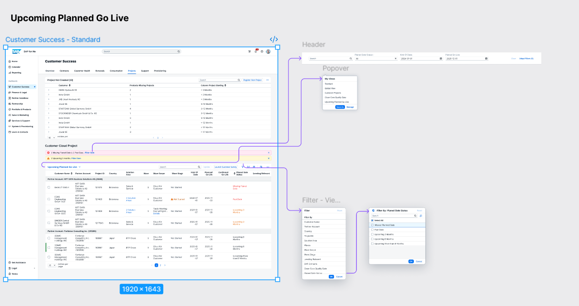
- KPI-driven view prioritizing projects by go-live urgency.
12 — Journey map
Before vs. after.
Before
LegacyManual copy/paste of project ID; missing identifiers.
Hunt across screens for status and identifiers; no single source of truth.
Multi-screen navigation, non-intuitive workflow, delays.
Bundle clutter, overwhelming display; hard to update related items.
No visibility into dates or urgency; reactive firefighting.
After
RedesignClickable project ID, guided form, clear identifiers.
Clickable project ID and summary tags surface the right details instantly.
Inline 'Request Update' CTA — reduced friction.
Expandable bundles with progressive disclosure.
Color-coded KPI indicators — Missing / Past Due / Upcoming.
13 — Outcomes & impact
Measurable improvements for partners and stakeholders.
Users who could identify urgent updates
Before vs. after redesign
14 — Key takeaways
What I carried from SAP for Me.
- Empathy-driven design revealed real gaps in project visibility and update workflows.
- Balancing compliance vs. usability was critical when Fiori system constraints limited familiar features.
- Quick wins plus a scalable redesign delivered both immediate impact and long-term adaptability.
- Cross-stakeholder collaboration ensured business alignment and user satisfaction in parallel.